Step 15: Build Custom Dashboards
Create professional operator interfaces with drag-and-drop layouts.
Full reference
For complete details, field tables, and limitations, see the Dashboards reference.
From Data to Interface
You've connected devices, built automations, and set up monitoring. Now you can create custom dashboards that present exactly what operators need to see: no more, no less.
ControlBird's Layout Editor lets you design clean operator interfaces by arranging widgets on a canvas. Each widget binds to live data and updates in real-time.
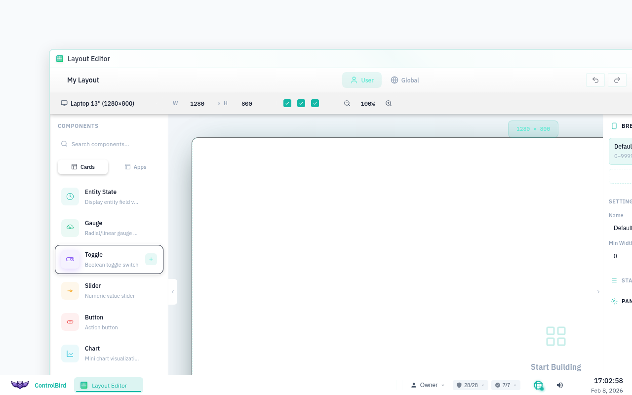
Opening the Layout Editor
Click the ControlBird logo in the taskbar and select Layout Editor. You'll see options to create a new layout or edit existing ones.
Creating a New Dashboard
- Click + New Layout in the toolbar
- Enter a name for your dashboard (e.g., "Living Room Control")
- Choose a grid size: Small (1280px), Medium (1920px), or Large (2560px)
- Click Create to open the editor
The Editor Interface
The Layout Editor has three main areas:
Drag widgets from here onto the canvas. Categories include gauges, charts, controls, text, and shapes.
Your working area. Widgets snap to a grid for clean alignment. Resize and position by dragging.
Configure the selected widget: data source, appearance, labels, and behavior.
Available Widget Types
The widget palette offers a variety of components:
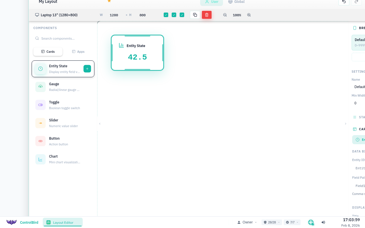
Binding Data to Widgets
Widgets become useful once you connect them to live data. Here's how:
- Drag a widget onto the canvas (e.g., Value Display)
- With the widget selected, look at the Properties Panel
- Click the Data Source field
- Browse or search for the entity field you want to display
- Select it, and the widget now shows live data
Quick Binding
You can also drag entities directly from the Database Browser onto the Layout Editor canvas. ControlBird will create an appropriate widget and bind it automatically.
Styling Widgets
Each widget has styling options in the Properties Panel:
Testing Your Dashboard
Before publishing, preview how your dashboard will look to operators:
- Click Preview in the toolbar
- The editor switches to view mode with live data flowing
- Test controls to ensure they work correctly
- Check that conditional formatting triggers as expected
- Click Edit to return to design mode
Publishing and Sharing
When your dashboard is ready:
- Click Save to preserve your work
- Click Publish to make it available to users
- Configure access permissions (which roles can view/edit)
- Optionally set as a default dashboard for specific roles
Published dashboards appear in the Layouts menu for users with appropriate permissions.
Dashboard Hierarchy
You can create multiple dashboards for different purposes: an overview for managers, detailed controls for operators, and monitoring views for technicians. Users can switch between layouts as needed.
Dashboard Best Practices
Use containers to visually organize widgets by function or location.
Place critical values at the top-left where eyes naturally start.
Reserve red for alarms, green for normal. Avoid purely decorative colors.
Consider where the dashboard will be viewed: control room, tablet, or phone.
Troubleshooting
Widget shows "No Data" even though the entity exists
- Check the binding path: Verify the full path in Properties matches the entity
- Check permissions: The viewing user may not have read access
- Check field type: Some widgets only work with specific data types
Changes aren't appearing for other users
Make sure you've clicked Publish after saving. Saved layouts are drafts until published. Other users see only published versions.
Control widgets aren't working
- Verify the target field accepts writes (not read-only)
- Check that the viewing user has write permissions
- Ensure the value range matches the control's configured limits